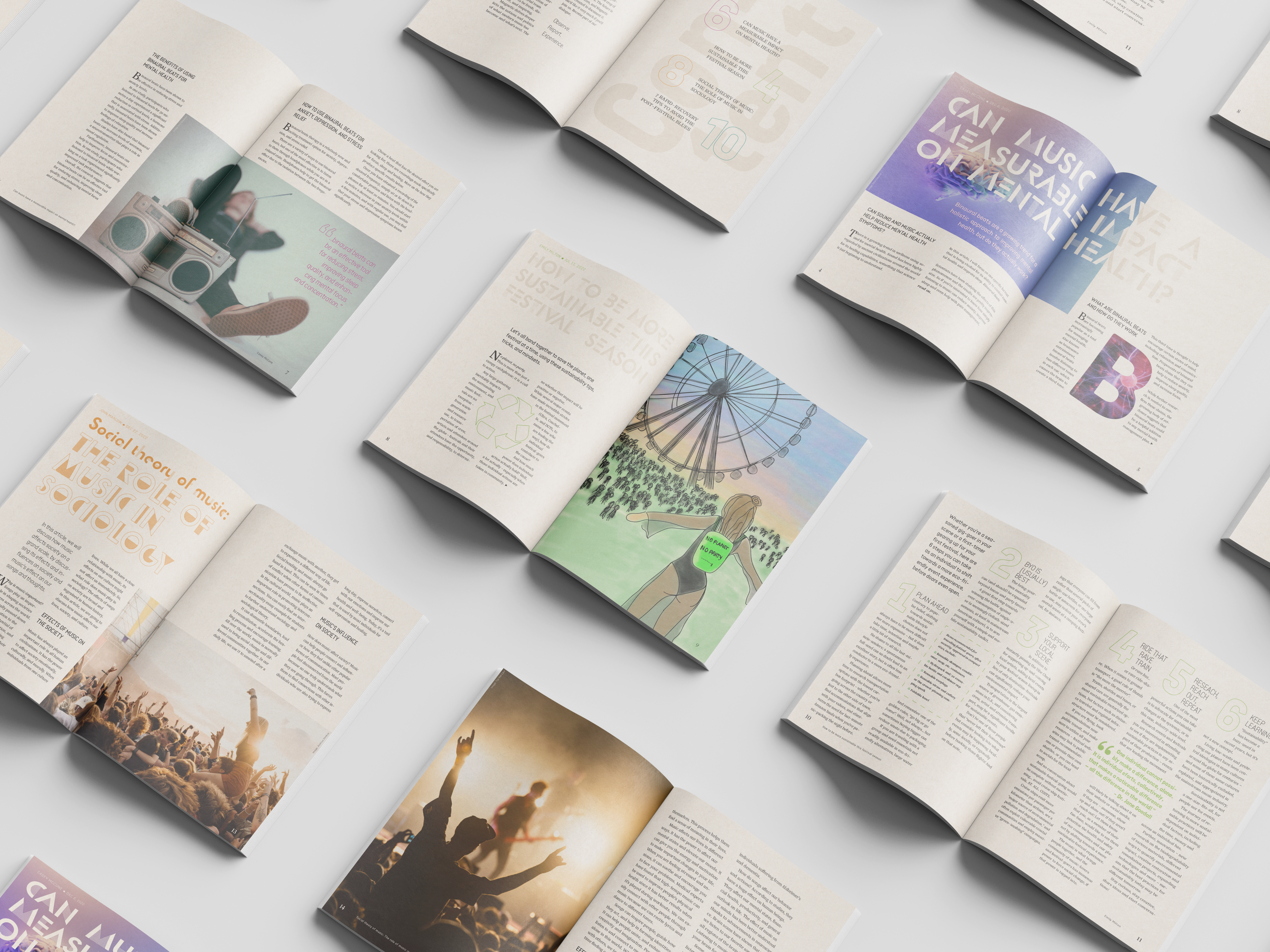
Graphic Design: Magazine Layout
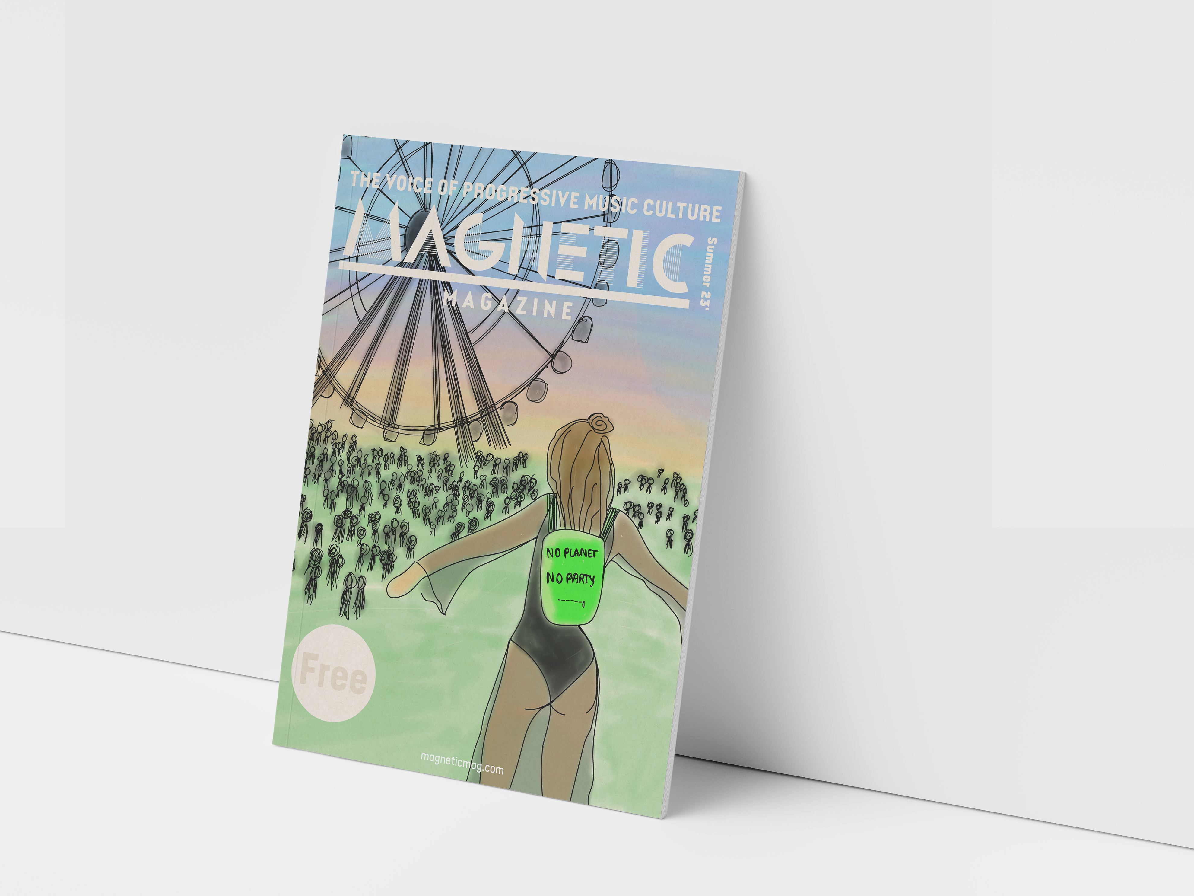
In this assignment the task was to create a paper version of an online magazine. The online magazine is called Magnetic Magazine. The magazine will be handed out at events and should therefore work for a longer period of time and for different occasions and locations. The magazine consists of four articles from their online magazine. One of the articles will be their feature. This article needs a custom made artwork. This artwork will also be the front cover of the magazine.
The target group are mainly young adults from the ages of 18 to 34, where 2/3 of these are male. They are fan of the progressive music lifestyle, from veterans to neophytes. The style and content needs to resonate with this young audience; - their lifestyle and interests.
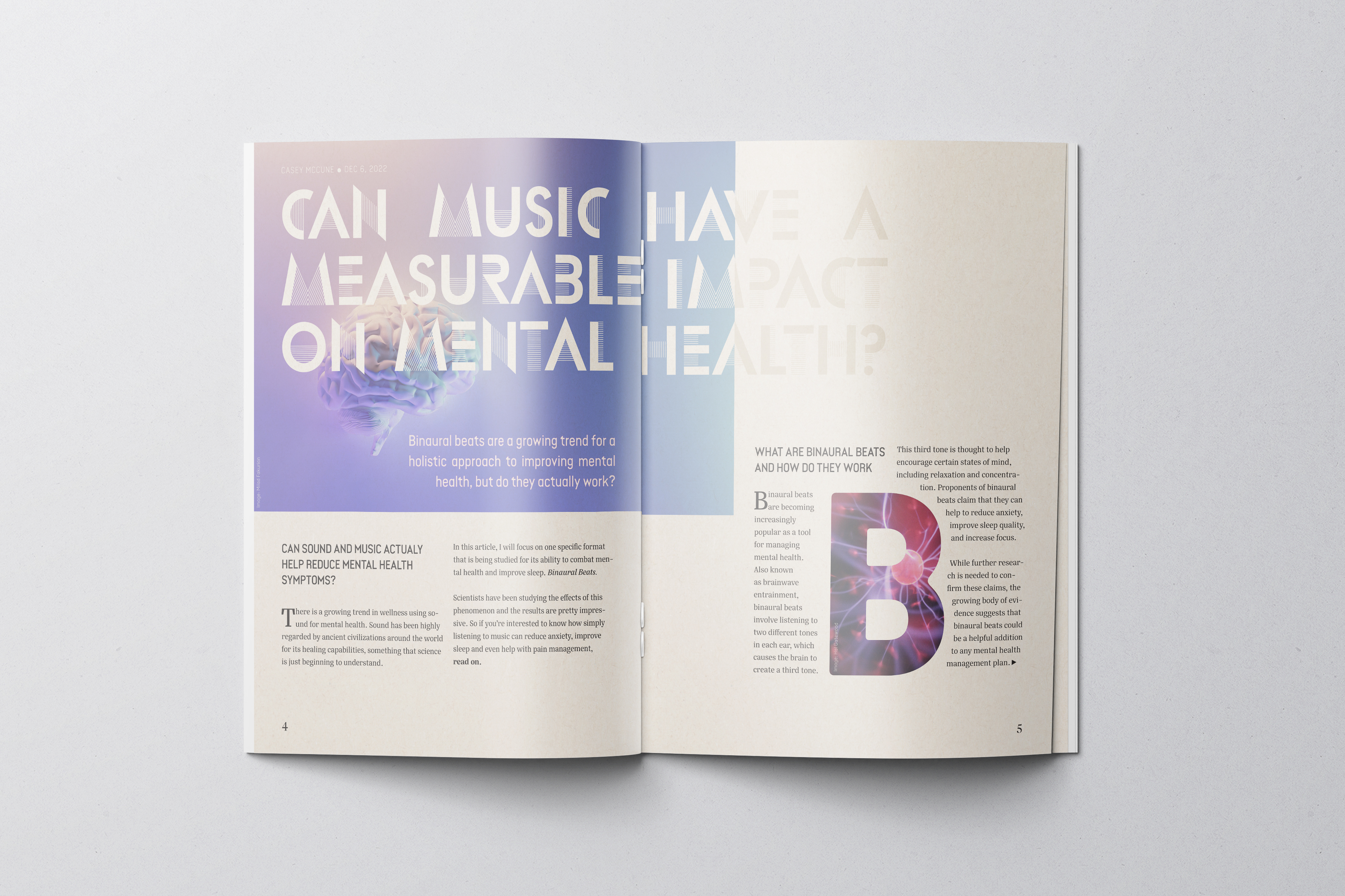
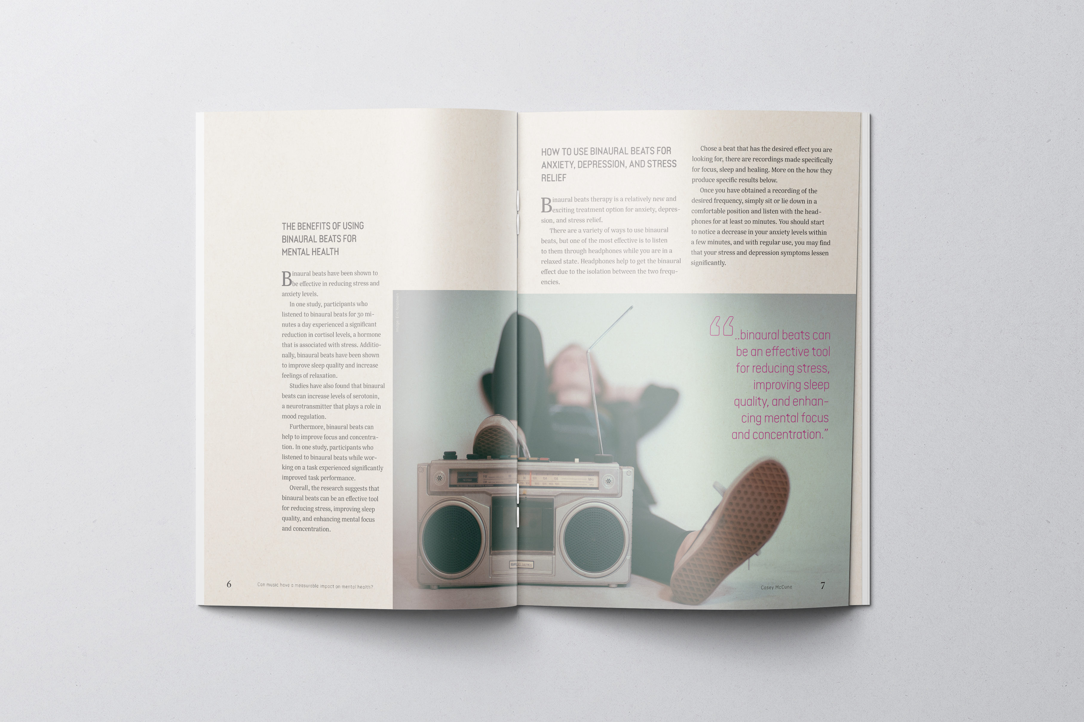
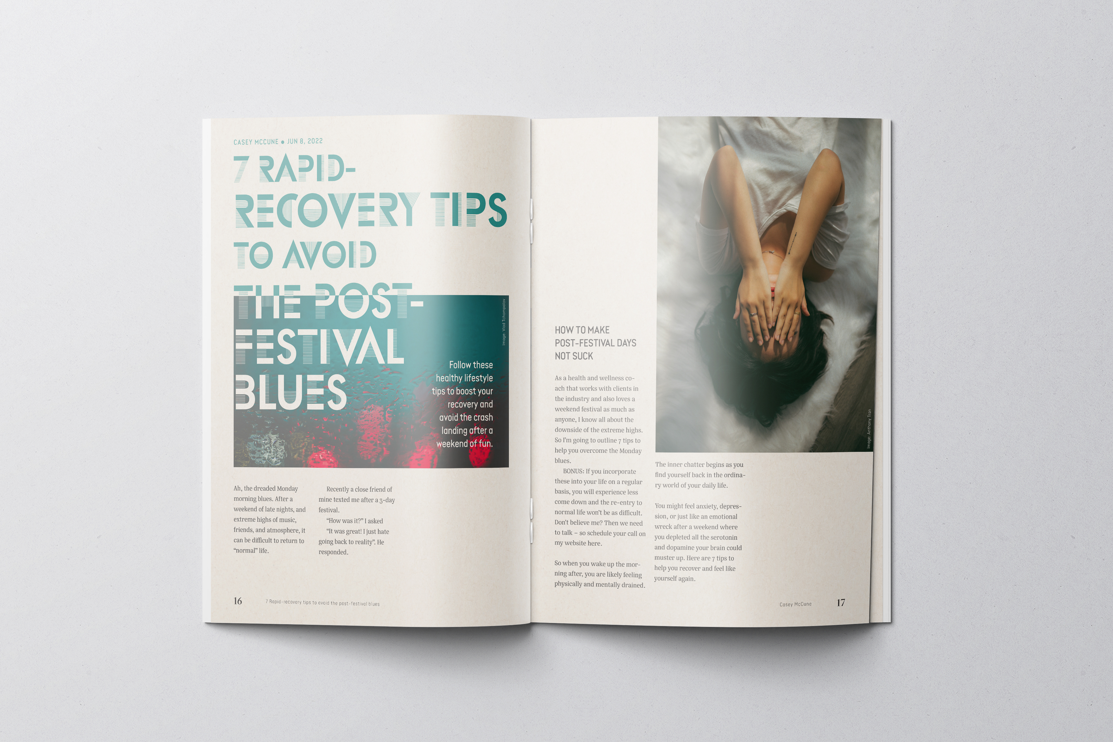
I’ve browsed through the magazine and all its articles in its various categories. Much of the content are music related with a focus on festivals. You can also see that the articles and their contents illustrates a way of life. There are a focus on sustainability, mental health, creativity, mindfulness, exploration and what some would say an alternative way of living.
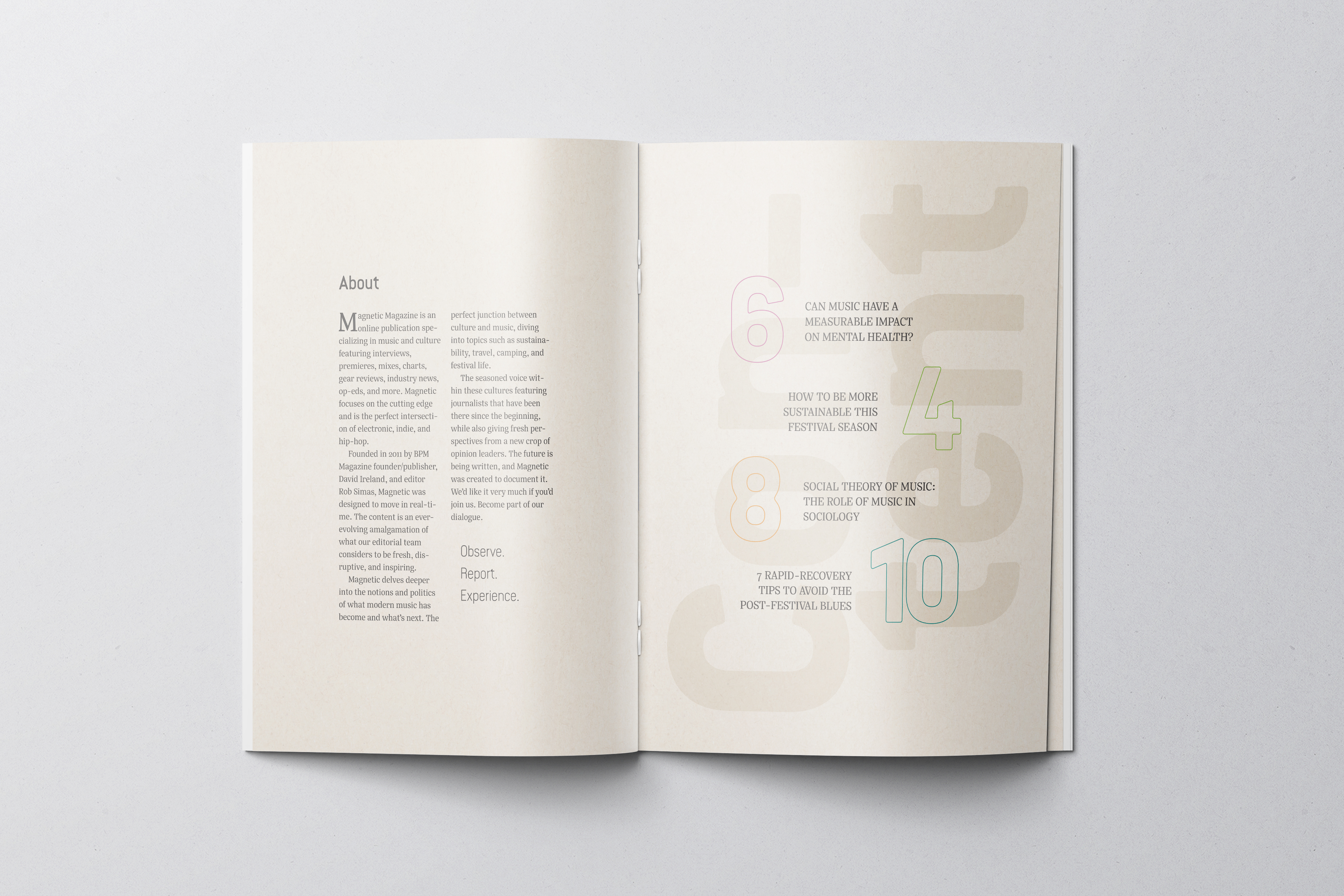
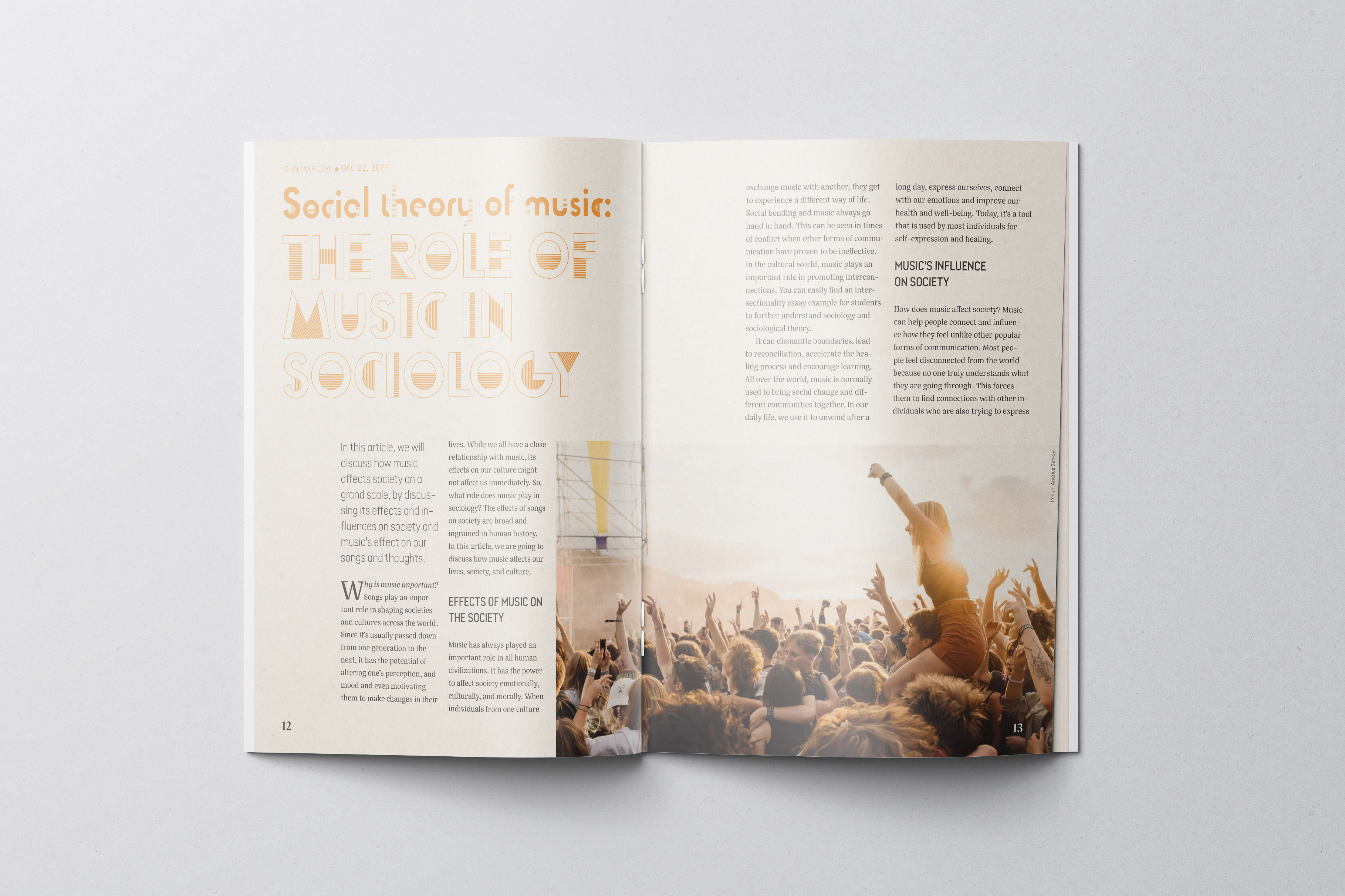
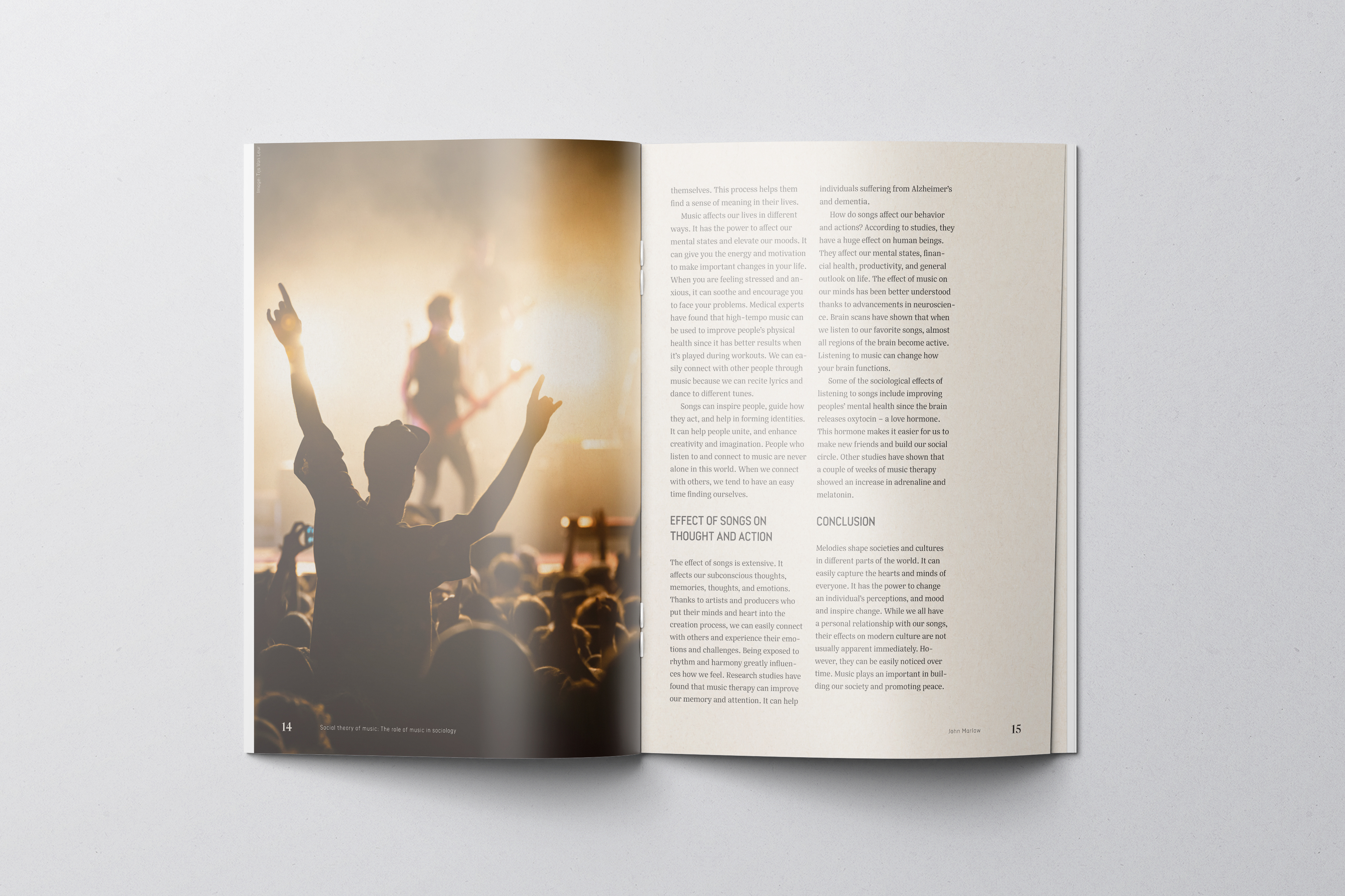
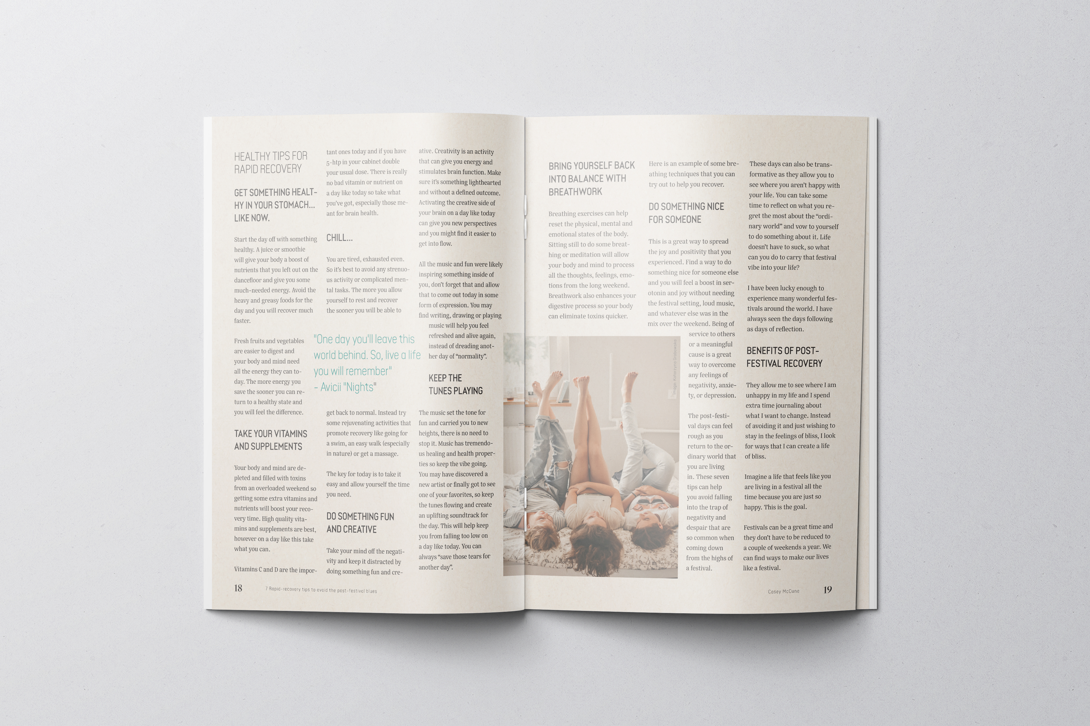
My interpretation was that for this type of magazine, contrast, play and color was essential. The feel of the layout had to be energetic. I went for a modern style in this design, with a fun and playful vibe. I have used basic beige colors as the base for the design, by using a natural paper texture on all the pages. But I also implemented vibrant colors throughout the design. Each article has its own color that represents the article, and that works with the images within the different articles.
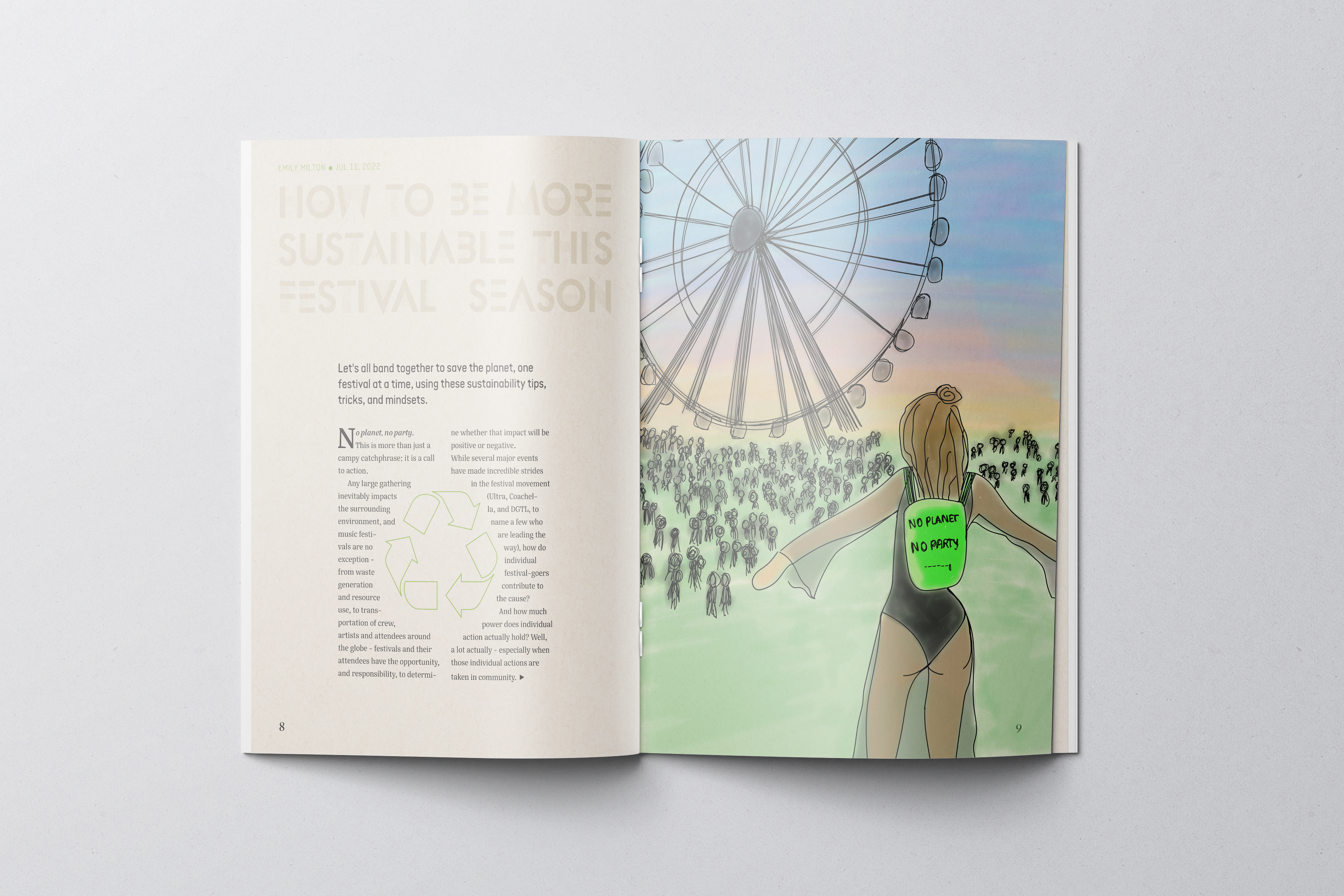
I chose to make the artwork for the feature article and the front page with a sketchy/watercolor style, as I felt that it would fit with the rest of the magazine, - the paper texture, sustainability, colours, vibe, etc. I wanted it to give out a crafted feeling.